※ Matplotlib 데이터 시각화
- Matplotlib 는 그래프를 그릴 수 있는데 오늘은 선 그래프(Line Graph)를 그려보았다.
속성으로는 linestyle, marker, color 값이 있는데 이는 작성자가 원하는 대로 변경이 가능하다
Line Styles
| - | 실선 |
| – | 대시 선 |
| -. | 대시 점 선 |
| : | 점선 |
Markers
| . | 점 | , | 픽셀 |
| o | 원 | s | 사각형 |
| v, <, ^, > | 삼각형 | 1, 2, 3, 4 | 삼각선 |
| p | 오각형 | H, h | 육각형 |
예시)
from elice_utils import EliceUtils
import numpy as np
import pandas as pd
import matplotlib.pyplot as plt
elice_utils = EliceUtils()
#이미 입력되어 있는 코드의 다양한 속성값들을 변경해 봅시다.
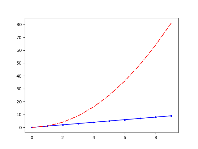
x = np.arange(10)
fig, ax = plt.subplots()
ax.plot(
x, x, label='y=x',
linestyle='-',
marker='.',
color='blue'
)
ax.plot(
x, x**2, label='y=x^2',
linestyle='-.',
marker=',',
color='red'
)
# elice에서 그래프를 확인
fig.savefig("plot.png")
elice_utils.send_image("plot.png")출력)
이에 추가로 그래프에 정보가 많이 담겨 있는 경우 데이터의 정보를 같이 표시해줄 필요가 있는데 이는
ax.legend() 라는 함수를 통해 구현할 수 있다.
예시)
from elice_utils import EliceUtils
import numpy as np
import pandas as pd
import matplotlib.pyplot as plt

elice_utils = EliceUtils()

x = np.arange(10)
fig, ax = plt.subplots()
ax.plot(
    x, x, label='y=x',
    linestyle='-',
    marker='.',
    color='blue'
)
ax.plot(
    x, x**2, label='y=x^2',
    linestyle='-.',
    marker=',',
    color='red'
)
ax.set_xlabel("x")
ax.set_ylabel("y")

#이미 입력되어 있는 코드의 다양한 속성값들을 변경해 봅시다.
ax.legend(
    loc='center left',
    shadow=True,
    fancybox=True,
    borderpad=2
)

# elice에서 그래프를 확인
fig.savefig("plot.png")
elice_utils.send_image("plot.png")
출력)

참고로 ax.legend() 함수 내에서 loc 이라는 위치 옵션을 아래 표에 나와있는 대로 문자형 혹은 code를 바꾸어
범례가 나오는 위치를 변경 할 수 있다. 현재 예시 그래프 에서 나와있는 범례는 loc = 'center left' 혹은
loc = 6 이라고 할 수 있겠다.
| ‘best’ | 0 | ‘center left’ | 6 |
| ‘upper right’ | 1 | ‘center right’ | 7 |
| ‘upper left’ | 2 | ‘lower center’ | 8 |
| ‘lower left’ | 3 | ‘upper center’ | 9 |
| ‘lower right’ | 4 | ‘center’ | 10 |
| ‘right’ | 5 | - | - |
'기타 > What I Learned' 카테고리의 다른 글
| [TIL] 2021.10.22 (0) | 2021.10.22 |
|---|---|
| [AI] Matplotlib 데이터 시각화(2) (0) | 2021.10.21 |
| [AI] 그룹으로 묶기 (0) | 2021.10.19 |
| [자료구조&알고리즘] 힙(Heaps(2)) (0) | 2021.10.18 |
| [자료구조&알고리즘] 힙(1) (0) | 2021.10.16 |